Comparing Statistical Diagrams (Edexcel IGCSE Maths)
Spec point —
6.1C
Comparing statistical diagrams
How do I compare statistical diagrams?
-
You may be given two graphs for two different data sets with the same context
-
Compare trends in the graphs
- Increases, decreases, maximum points
- Steepness of the change
-
Comment on differences and similarities
-
Explain clearly which part of the graph you are talking about
-
Use **numbers **from each data set in your comparisons
-
Comment on any extreme values (outliers)
-
Calculate means, medians or modes to compare averages
-
Calculate ranges to compare the** spread** of values
Exam Hint Always relate numbers and calculations back to the context of the question.
If you don't, you won't score all the marks!
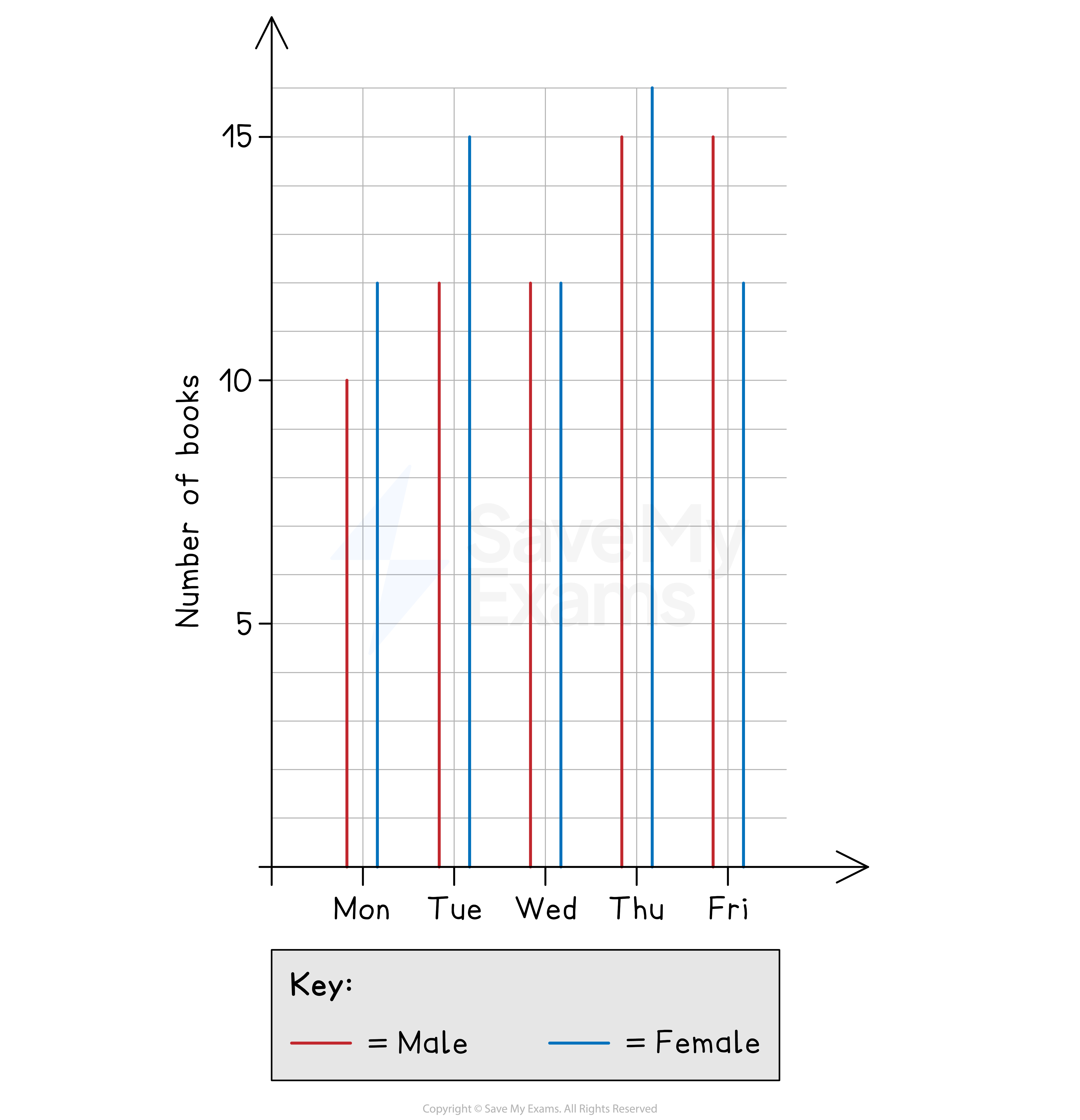
Worked Example The number of books bought during the opening week of a new bookshop is shown below. The shopkeeper wants to investigate shopping patterns between male and female customers.
(a) Briefly summarise the overall trend in the number of books bought by male customers.
Answer:
Look at the heights of the red lines Comment on how they increase ('briefly' means you do not have to talk about every point) Use numbers from the graph and exact phrases from the question
Final answer: The number of books bought by male customers increases from 10 on Monday up to 15 on both Thursday and Friday
(b) The shopkeeper says that the changes in the blue lines suggest that the amount of books bought by females varies more than males.
By comparing a suitable statistical measure, show that this is not necessarily true.
Answer:
Variations refers to the spread of data, so compare their ranges For male and female, subtract the smallest value from the biggest value
Male range is 15 - 10 = 5
Female range is 16 - 12 = 4
Compare the numbers Explain how this relates to the spread of the data State how your findings do not agree with the shopkeeper
Final answer: The range of male customers is greater than that of female customers, 5 > 4 This suggests male customers have a greater spread (variability) in books bought This is the opposite of what the shopkeeper said
(c) Give one reason as to why the shopkeeper should not use the data shown to draw conclusions about shopping patterns.
Answer:
Reread the sentences at the beginning This data is for the opening week of the bookshop only State that this is unrepresentative of a normal week Give a specific real life example
Final answer: The data shown is for the opening week of the bookshop It is unlikely to be representative of a normal week The numbers may increase as the bookshop becomes more popular
Was this revision note helpful?
Build on this topic